COVID-19 Global Dashboard
Ideal for public health teams, data journalists, and anyone who needs a clear, global view of the pandemic
This dashboard was created to demonstrate what’s possible when clean design meets critical data. Built as part of our HexLite concept kit, this layout pulls together global COVID-19 statistics in a format that’s fast, visual, and dead simple to interpret.
Think of it as a case study in turning overwhelming, chaotic data into something immediately useful — and honestly, just nice to look at.
Key Features
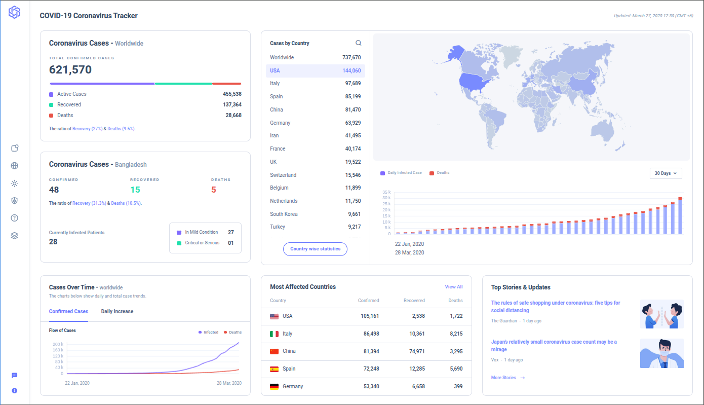
Global Case & Death Totals At-a-glance metrics for total confirmed cases, recoveries, and fatalities — updated in real-time and designed for clarity, not fear.
Geographic Spread Map A dynamic world map showing regional outbreaks, hotspots, and recovery zones. Heatmapping makes it easy to spot emerging trends by country or continent.
Daily Case & Death Trends Interactive line graphs showing daily case counts and mortality rates — useful for tracking waves, policy impacts, and vaccine rollouts.
Vaccination Progress Tracker Visual breakdown of total vaccinations, percent of population vaccinated, and booster rates — organized by country or global averages.
Country-by-Country Comparison Table Searchable, sortable list of nations with key stats side-by-side — great for data nerds and decision-makers alike.
Use Cases
Perfect for:
- Health authorities communicating with the public
- Newsrooms and media sites covering pandemic data
- Researchers and policy teams analyzing outcomes over time
- Design teams looking for best practices in visualizing sensitive data
This dashboard isn’t tied to a specific client — it’s a demonstration of what we can do when the stakes are high and the data is global. Part of our HexLite kit, it shows how thoughtful UI and clear data design can make complex information not just digestible, but actionable.
Need something similar for weather data, global logistics, or crisis monitoring? Let’s build it.